AMADEUS PLATFORM
An IoT platform for preventing 10% of all manufacturing industry stoppages
Year: 2020
Duration: 20 weeks
Roles: Workshop Facilitator, Lead Product Designer
Processes: Design Sprint, Research, Design, Prototype, Test, Iterate
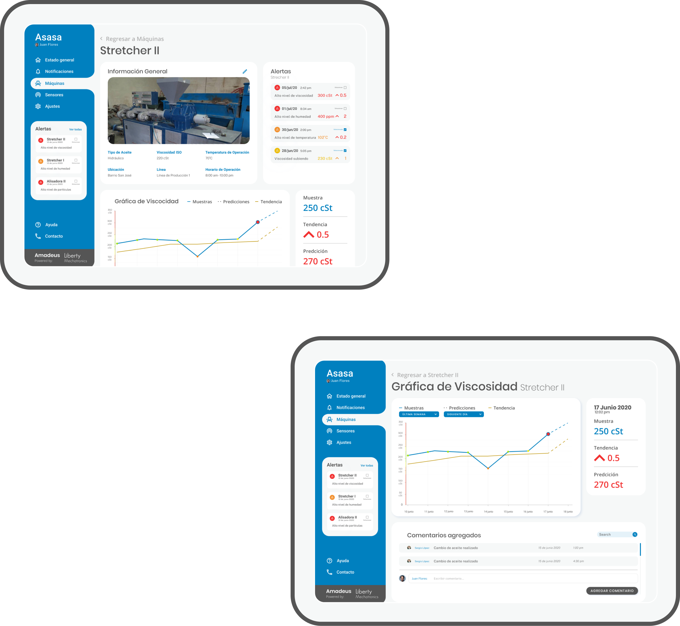
10% of all stoppages in the manufacturing industry are due to machine failure as a consequence of erosion of oil quality, and the only way to know the current characteristics of the oil is through a lab analysis that usually takes 2 weeks. Liberty Mechatronics created a sensor that attaches to the machine so that it can analyze the qualities in real-time, record them, set the trend, and later on predict its erosion rate. The goal was to give engineers and technicians a new tool to prevent stoppages due to oil and be able to see the quality graphs on their computer through an online platform.
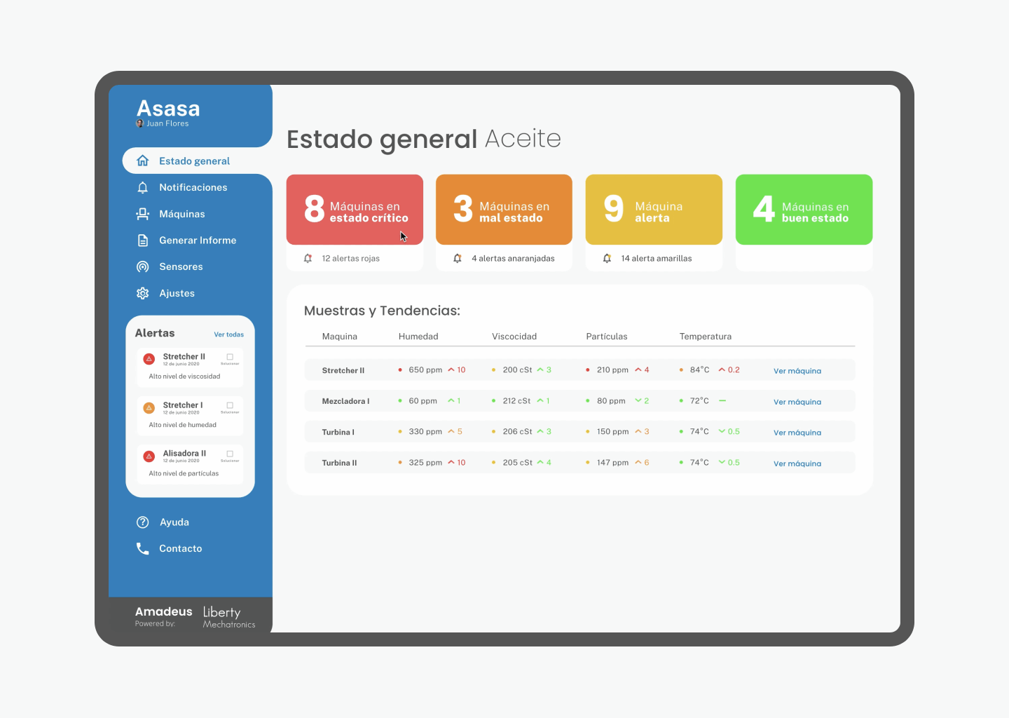
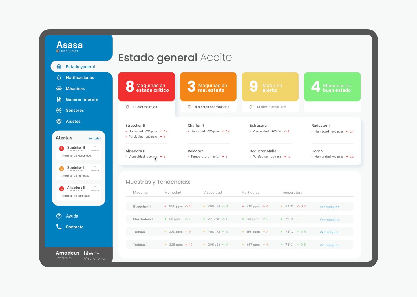
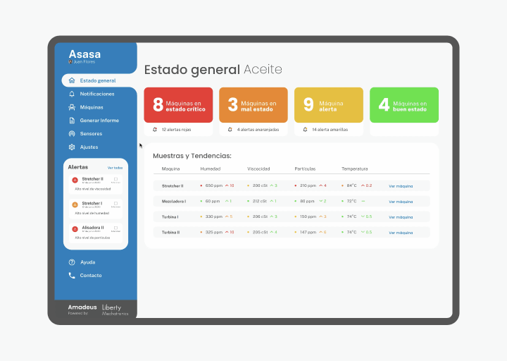
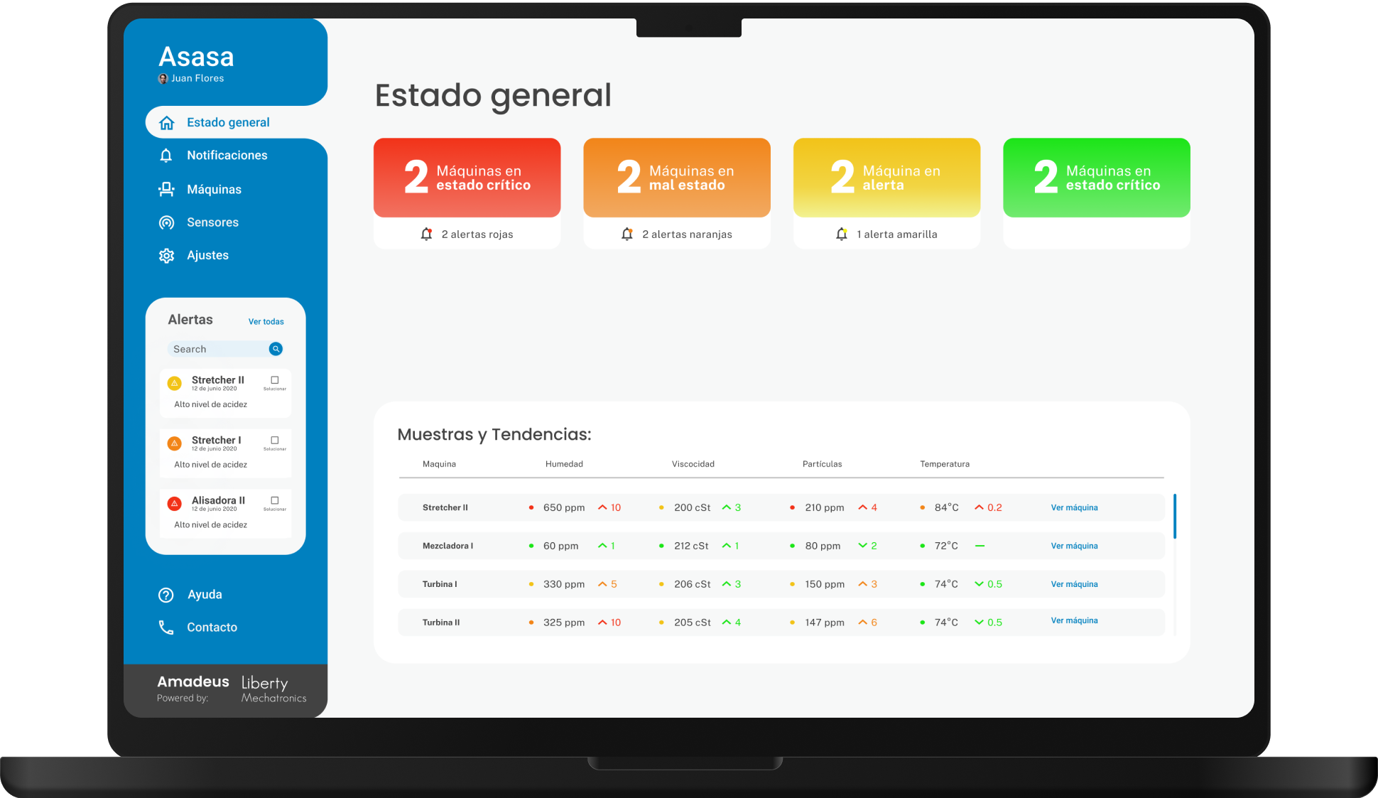
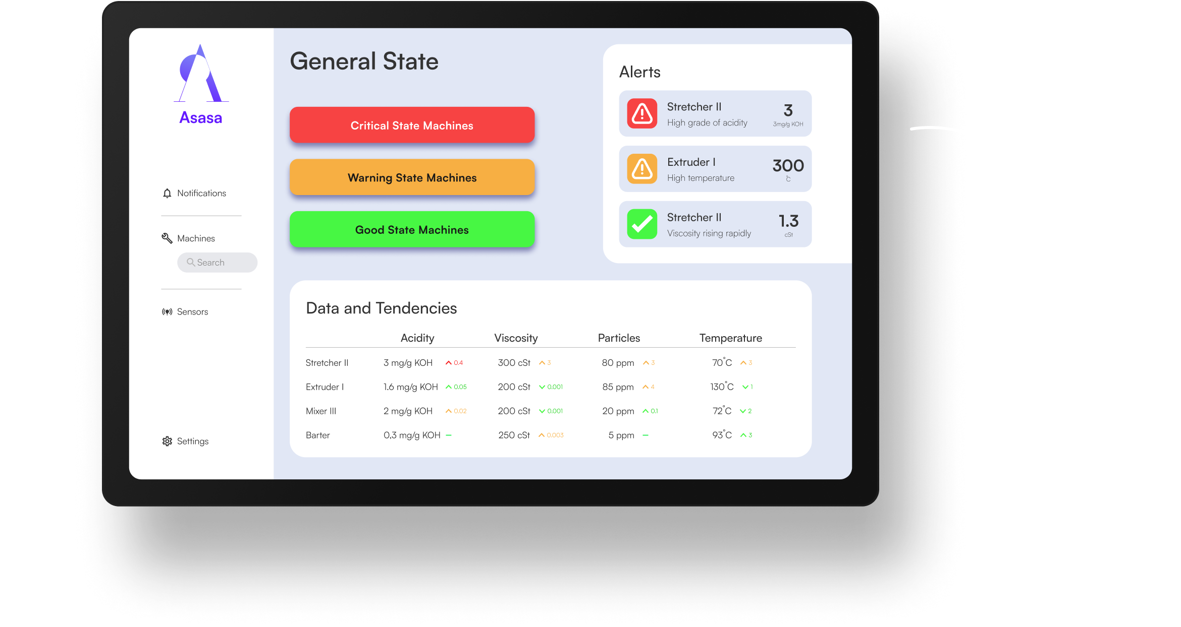
We designed a dynamic and intuitive web platform that integrated the sensor with the cloud to show our users the data of 5 different characteristics of their machine’s oil through tables, charts, and graphs. The platform also alerts users when an oil characteristic dips under a certain threshold of quality, leading the user to pay attention to the oil of that specific machine.
95%
Task success rate
83
SUS Score
8
Net Promotor Score
"Huge Potential"
- Senior Maintenance Engineer
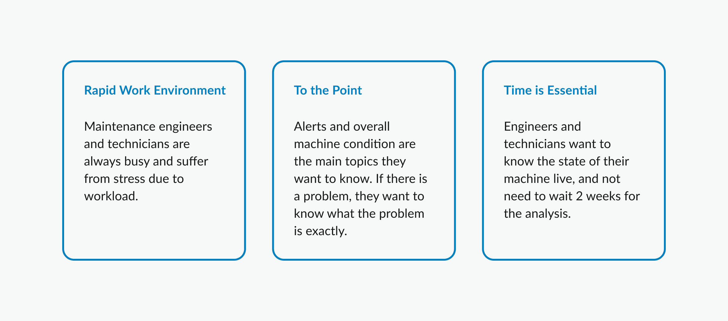
Initiating with the Right Direction
Losing a machine in a production line can be very costly, from time lost to lost product, many manufacturing companies have a specific division for preventive and predictive maintenance. These divisions work with raw data and all kinds of time frames to be able to come up with insights about the state of their production lines. We wanted to optimize and help the work of engineers and technicians, getting rid of the need for lab work, busy work, and manual data analysis through visual data and analysis in our cloud platform.
This was a first company product, start-to-finish project, which meant it passed through all the design thinking phases (mainly using the Herbert Simon process). There was stakeholder communication in each phase and user input in various steps of research and testing. As the lead designer on this project, I was responsible for leading workshops for decision-making and alignment; research, design creation; prototyping for testing, and handoff of assets and documentation.
Path validation in less than 2 weeks
One of the best ways to kick off a project is to undertake a design sprint. It is a 4-day process in which we test ideas and solve complex problems. In this case, we tested the idea of a status dashboard and alerts. Showing the machines that were in good, warning, bad, and critical state, then displayed an alarm for the machines that were critical.
Users (maintenance engineers and technitians) showed interest in the alarm system and visualization of the status of the machines. This verified our approach to the design and hierarchy of the features in the platform.
Research
Understanding the user
One of the more challenging aspects of this project was getting in touch with maintenance engineers. While they were eager to participate and share input, it was very hard getting a hold of them (that was later translated into the key insights, corroborated by research). There wasn’t enough time to wait for availability, which led me to utilize data from interviews and surveys.
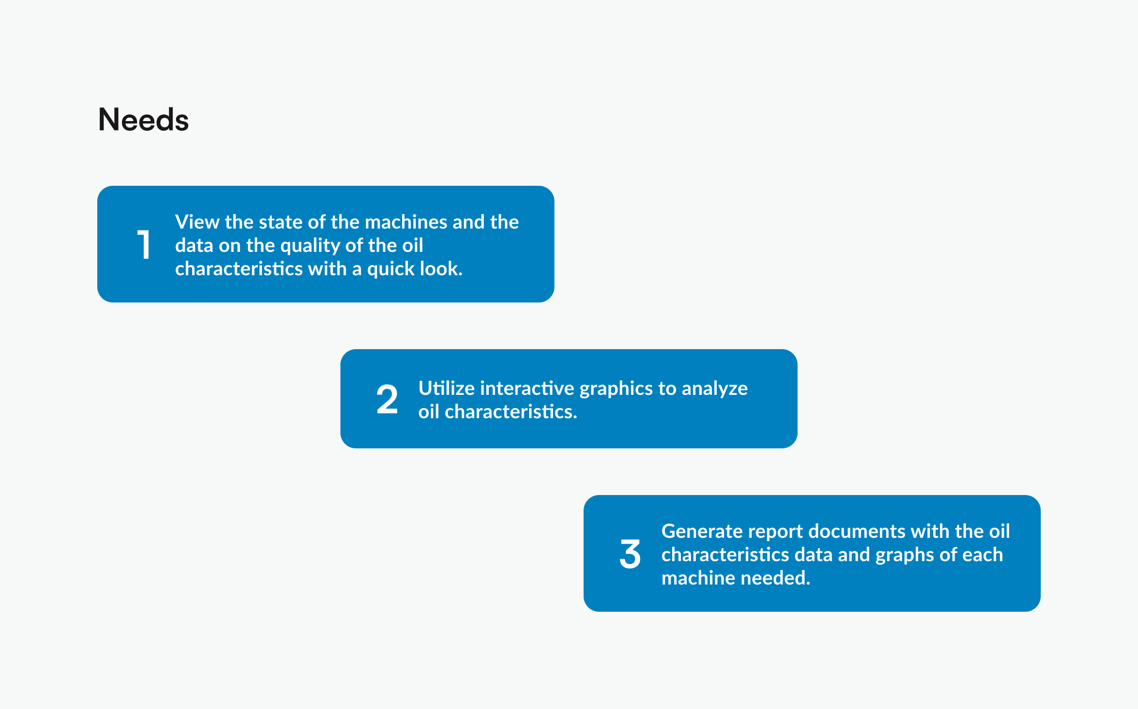
Engineer necessities and platform traffic
We identified the main needs (70% of all the interactions in the platform) of the engineers. This information gave us the hierarchy of features and the user flows we needed to build to validate our next iteration of the platform.
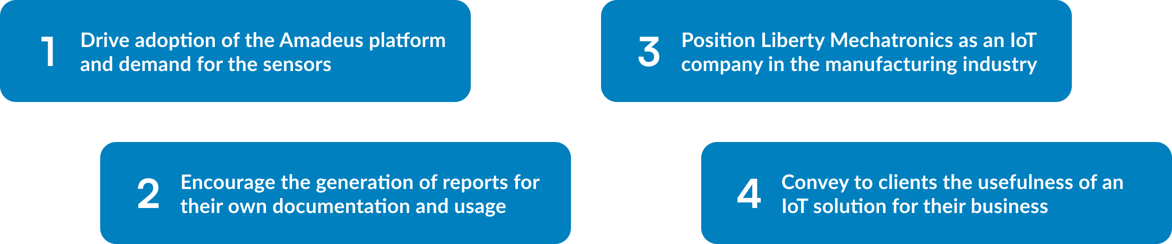
Aligning Liberty Mechatronics goals and project goals
Business Goals
1. Have a platform adoption rate of at least 60%.
2. Increase business conversion through sensor sales of at least 5 units per business in total for the initial test and launch phase.
3. Obtain an 80% of customer satisfaction.
4. Adding a sensor and/or a machine should take no more than 2 minutes for the user.
5. The platform should be optimized to run on old and new hardware.
UX Goals
1. User's primary focus should be on the state of the machine and data.
2. Reduce cognitive load through user interaction and animations.
3. Ensure that the data visualization platform is accessible to all users in any kind of hardware.
4. Components that denote a machine should display the state of that specific machine.
Designing an Industry-changing Platform
User flows
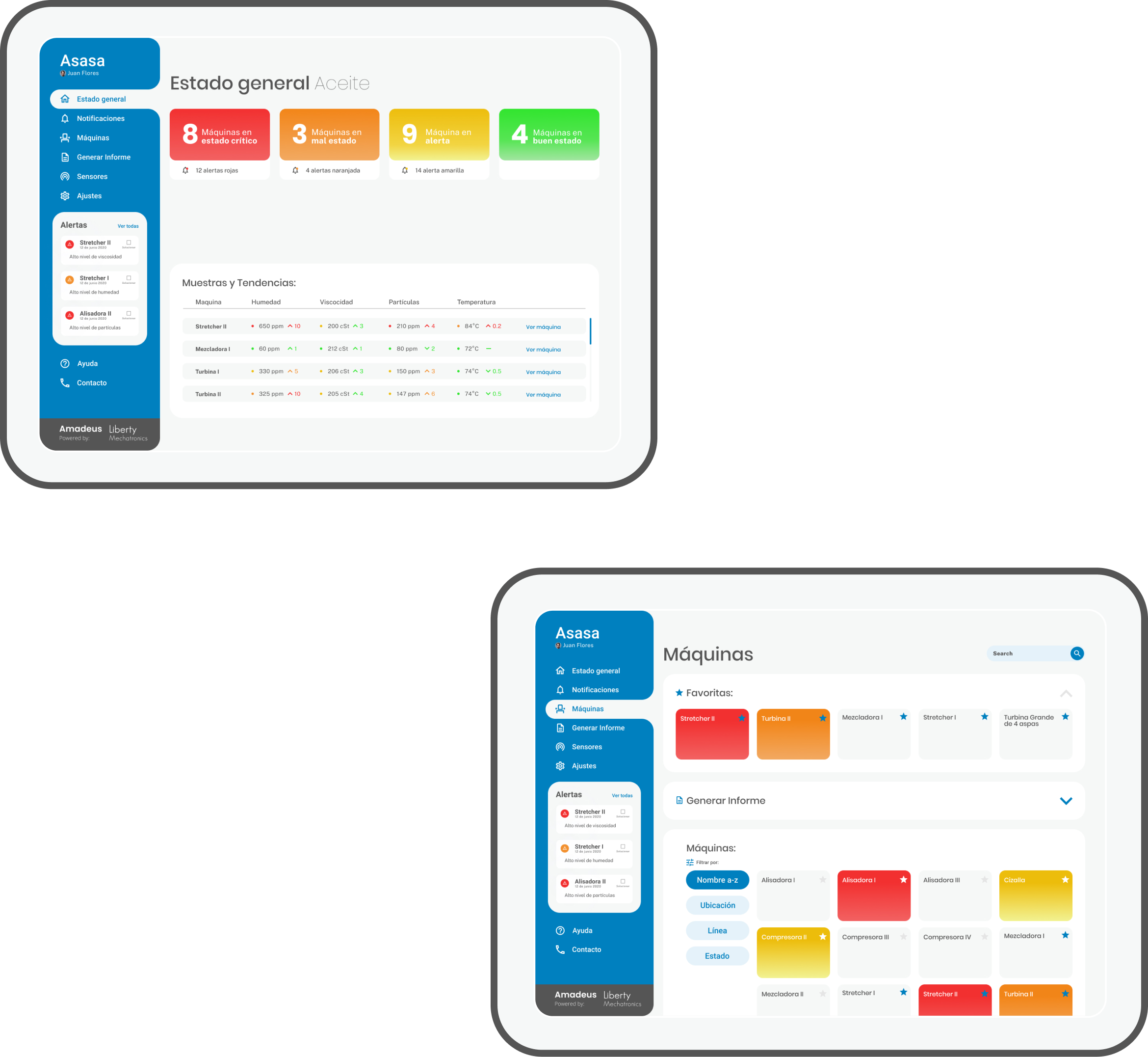
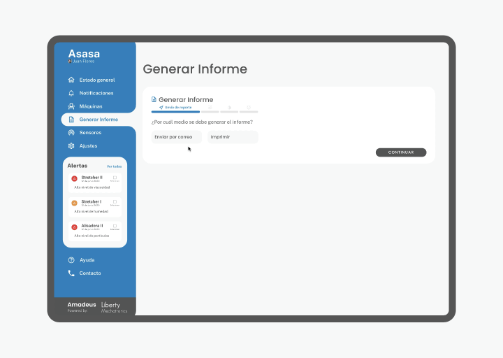
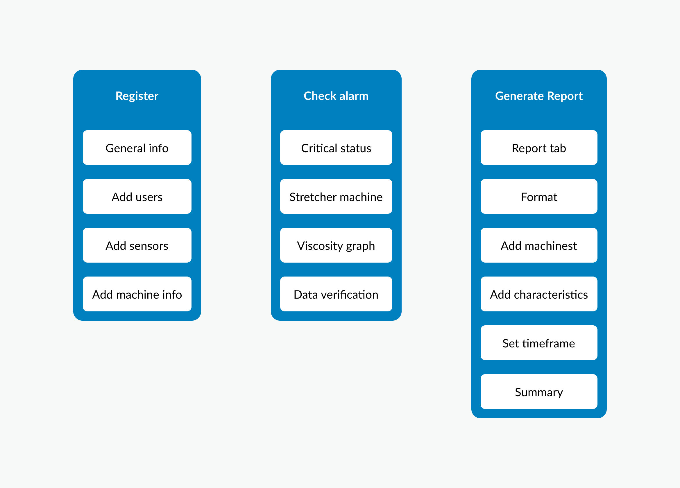
We developed 3 different main user flows: Register to the platform and add their sensors, Check the machine that sent an alarm, and generate a report. The registration flow would onboard the user and show the ease of use of the platform. Checking a machine would demonstrate the usefulness of the platform and the design of the data visualization for easier analysis. The last flow would display the ease of generating a report in the platform, to be sent as an email or for saving and printing.
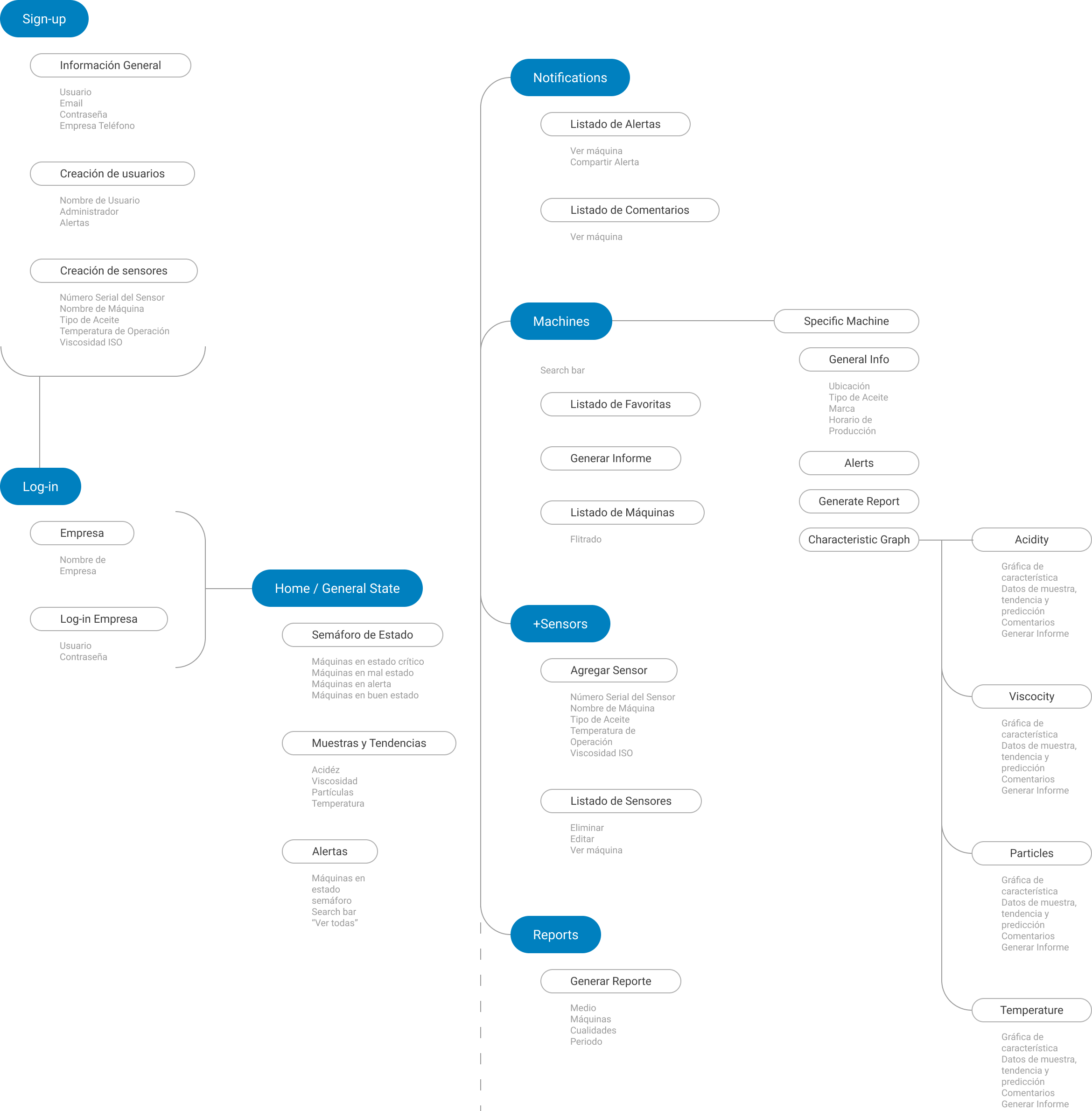
Platform architecture
After establishing the user flows, conducting the traffic analysis, and a card sorting analysis, we developed the platform architecture. The main section would show the state of the machines as well as the data of the most important machines. This would later branch out to notifications, a section for all machines, sensors, and reports (the places with high traffic).
Wireframes
Initially we used lo-fi wireframes to play with layouts and find the best way to visualize machine state and oil data. This led us to explore possibilities in nav functionality, sending the alerts to the sidebar, and giving the state graphic and oil data more real estate. The alerts would become a universal feature always present for the user.
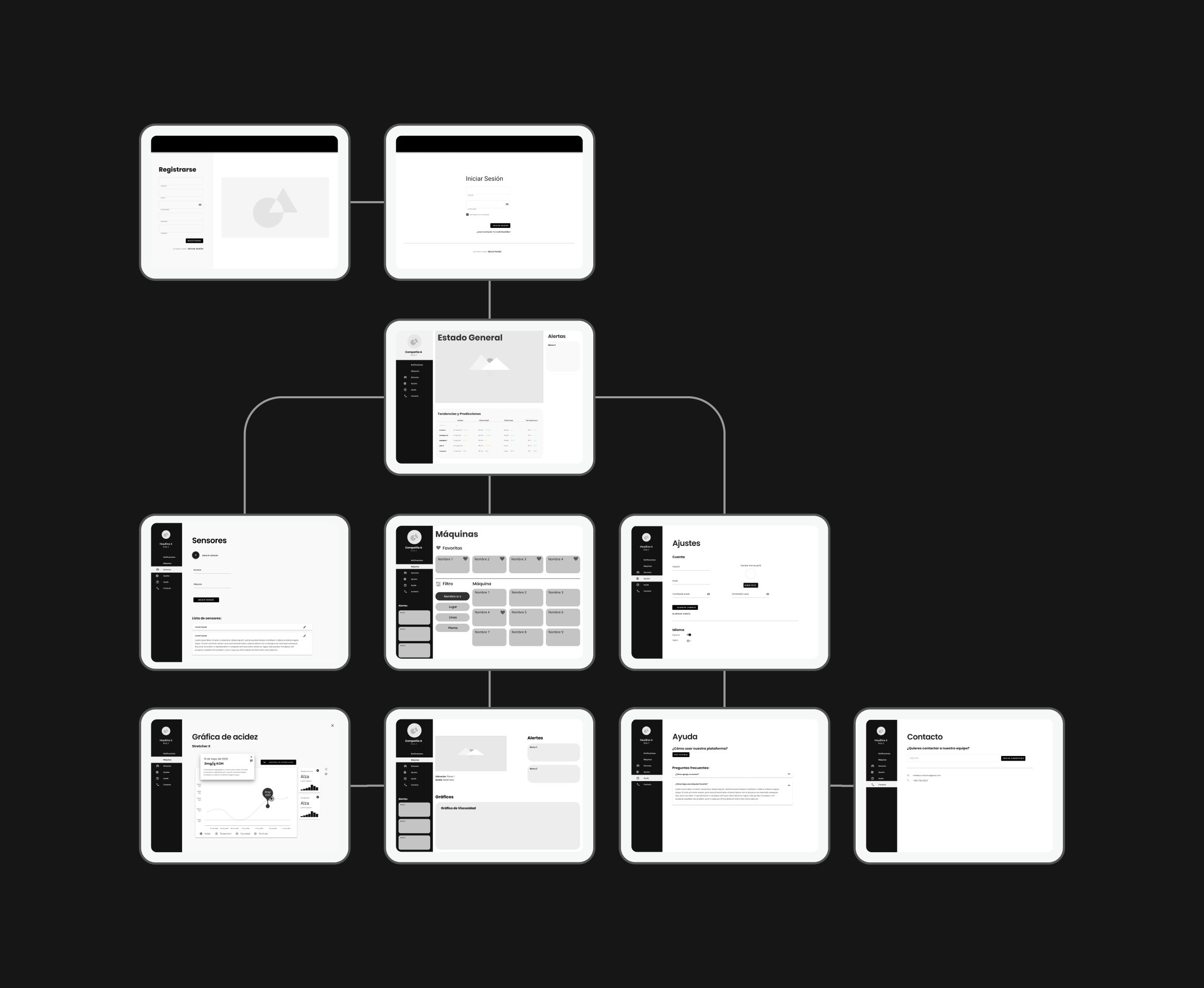
A Modern and Reliable Look
Due to the fact that the company was promoting itself as an IoT company, we went with a modern and reliable concept. This permeated through the minimalist and clean design, as well as the colors, typography, and platform navigation. The state of the machines was managed as a traffic light concept, making use of Jakob’s law.
The Amadeus Platform