EMATRÍCULA UCR
Improving the experience and reducing stress levels for students for time-sensitive class enrollment.
Year: 2021
Duration: 20 weeks
Roles: Product Designer, UX Researcher
Processes: Scope Canvas, Research, Design, Prototype, Test, Iterate
Enrolling in university courses amid pressures of time and course availability can be very stressful and result in a bad experience for students. In 2021, the University of Costa Rica wanted to redesign its enrollment platform (eMatrícula) that was used by students every semester. The goal of the redesign was to streamline the process and improve the platform’s usability for students, empowering them to plan and choose their academic path.
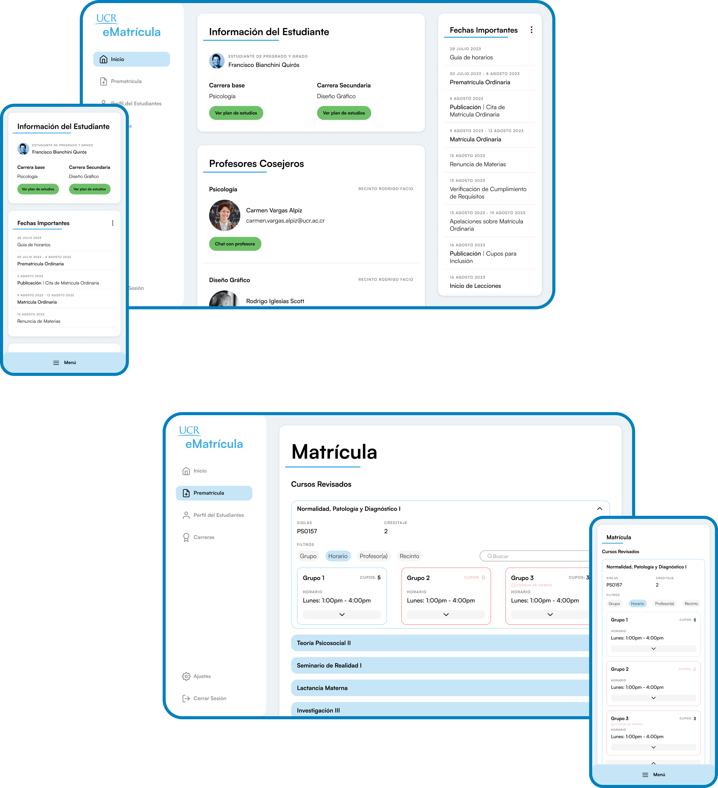
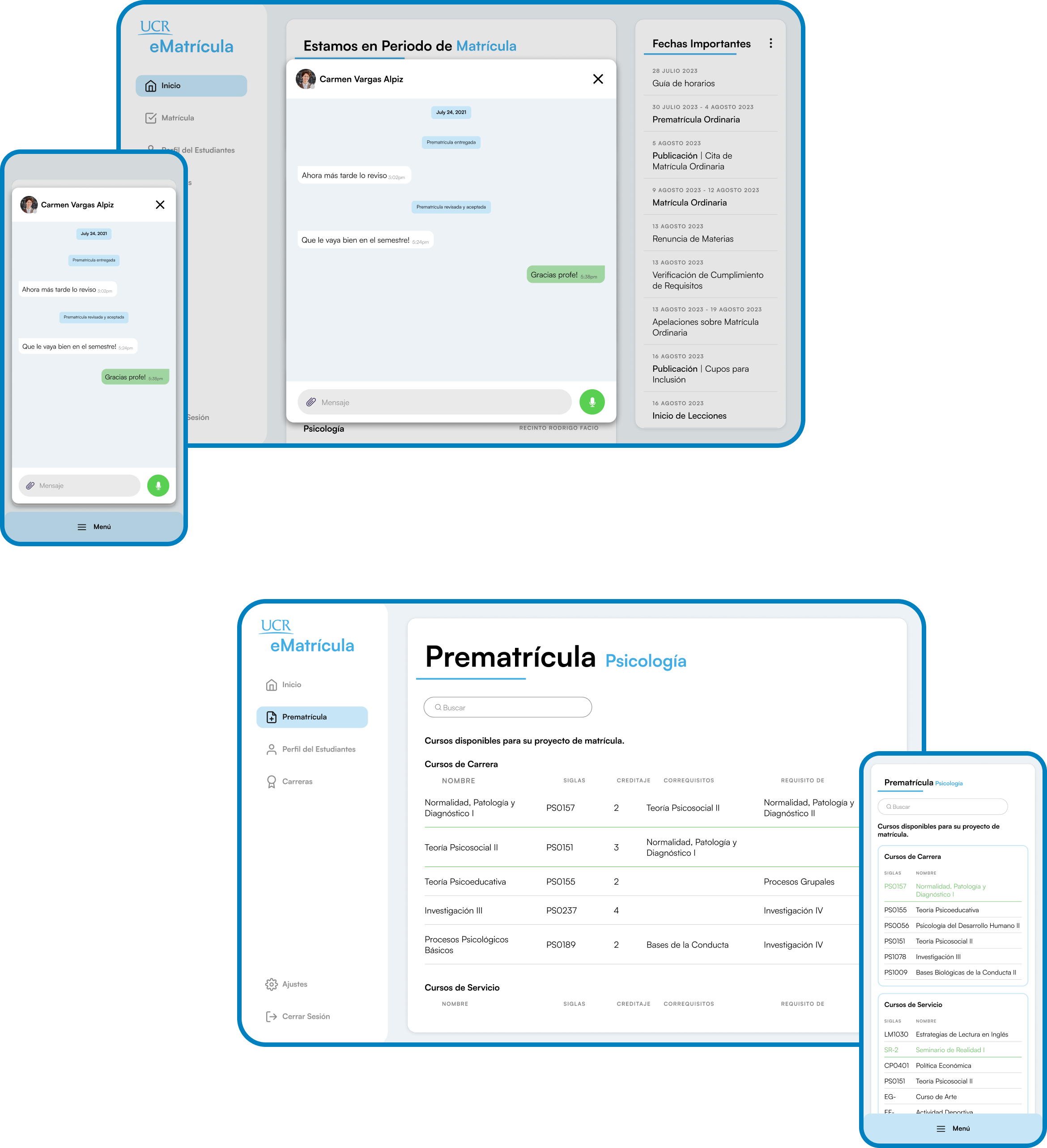
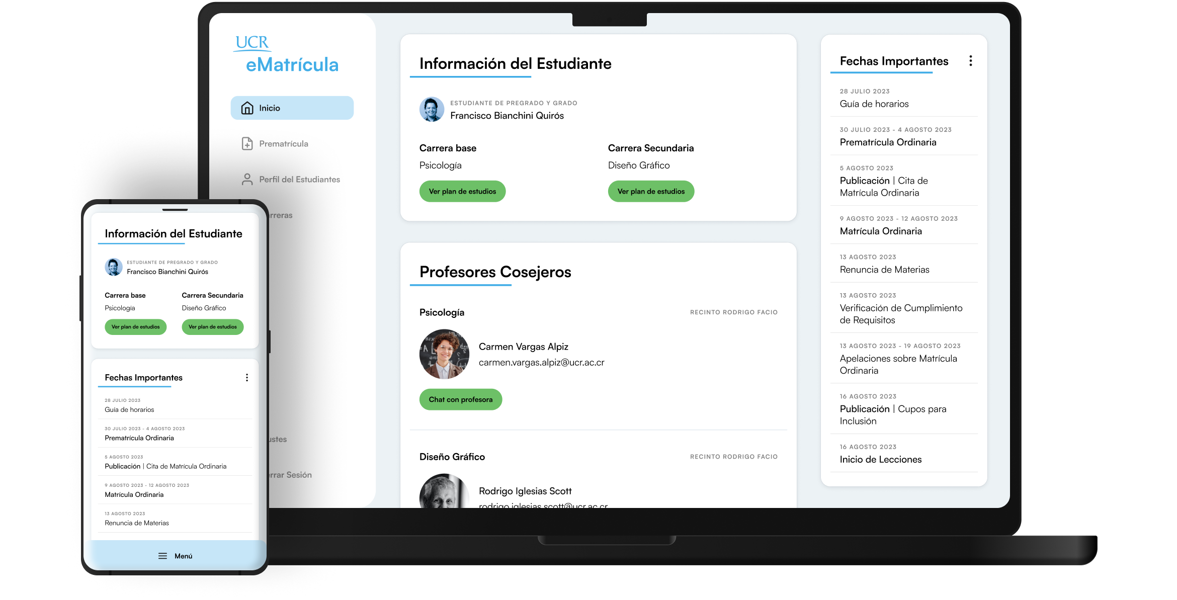
We designed an interactive and user-friendly platform that offers students a seamless enrollment experience for university students. Our design takes into account crucial factors such as the time of the year and bureaucratic procedures, all geared towards providing a better user experience.
40 to 85
SUS score
+45,000
Students
38% to 8%
Error rate
"Wish I had this as a freshman"
-Senior undergraduate student
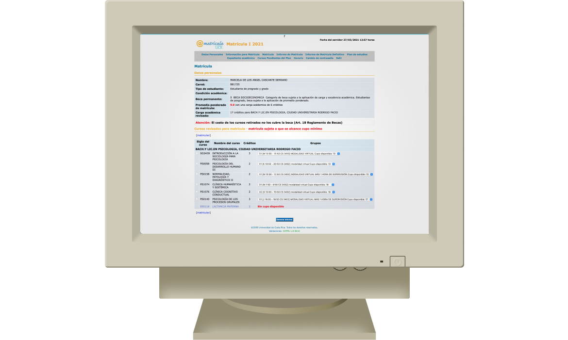
Before
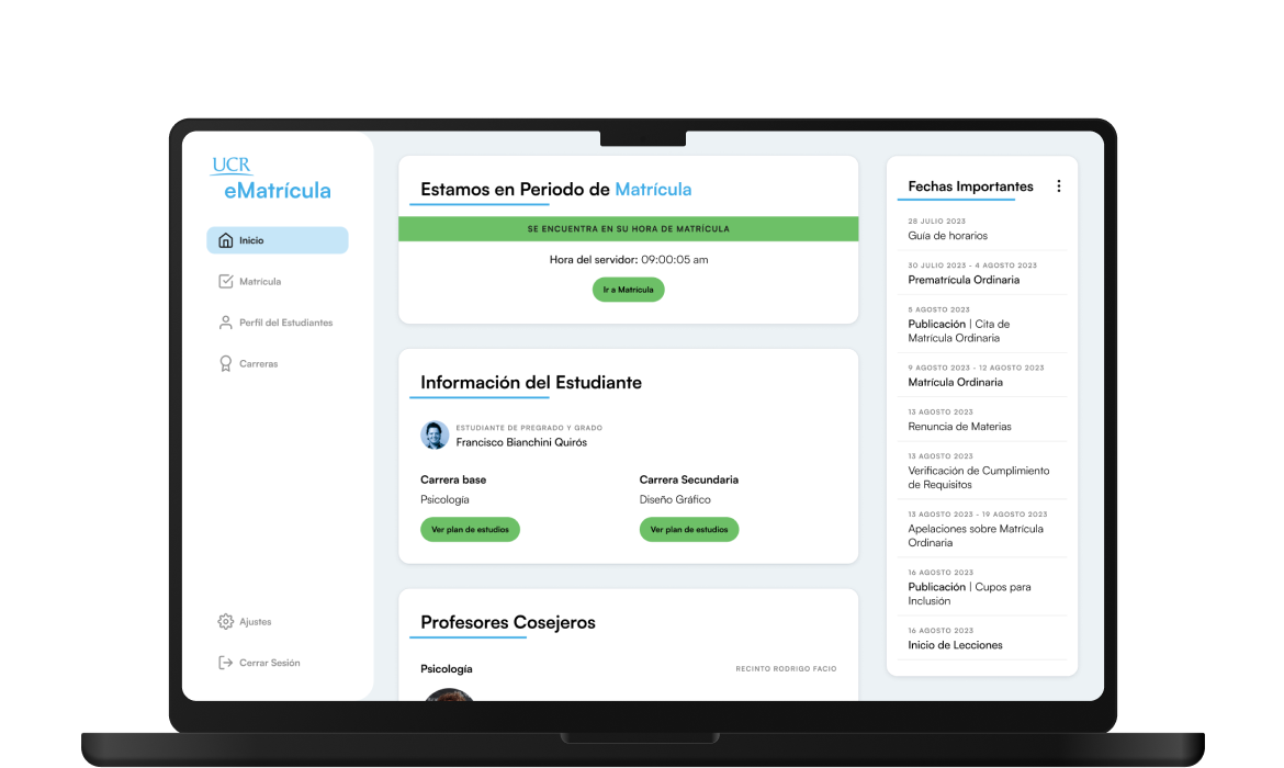
After
Understanding Both Sides
Enrollment at the University of Costa Rica occurs over a 3-day period. Each student is assigned a specific time slot within these 3 days, with priority given to those who achieved higher grades and completed a greater number of credits in the previous year. However, this system creates competition for course availability, leading to stress and anxiety among students. In response to this, we set out to alleviate that pressure and enhance the platform's user experience by redesigning and updating its visual style.
The university's Department of Registry and Admissions wanted to retain the enrollment process itself but granted us complete freedom in terms of architecture and visual style. This allowed us to introduce new features and design a platform that is both intuitive and student-friendly. As the UX designer on this project, I was responsible for stakeholder communication, research, ideation and creation, and prototyping for testing and gathering project insights.


Collaborating to scope the project
Wanting to get to know our stakeholders and users, we started our project through a scope canvas workshop. We gathered students and administrators to gain insights into their motivations, needs, and objectives for a new enrollment platform.

This workshop helped us gain insights into the needs of both the students and the university administration. The significance of a simple interface, accessibility, and maintaining a consistent enrollment process emerged as the major focal points for the project.
Research
New users got confused in the middle of the flow.
Comprehending the flow of the process and understanding users' thoughts and behaviors was paramount to the project. The process is divided into two distinct parts: pre-enrollment and enrollment. During pre-enrollment, students inform the university about the courses they may enroll in for the next semester. This information is subsequently reviewed and accepted by an academic advisor or returned to the student for revisions. Enrollment then involves officially registering for some or all of the pre-enrolled courses.
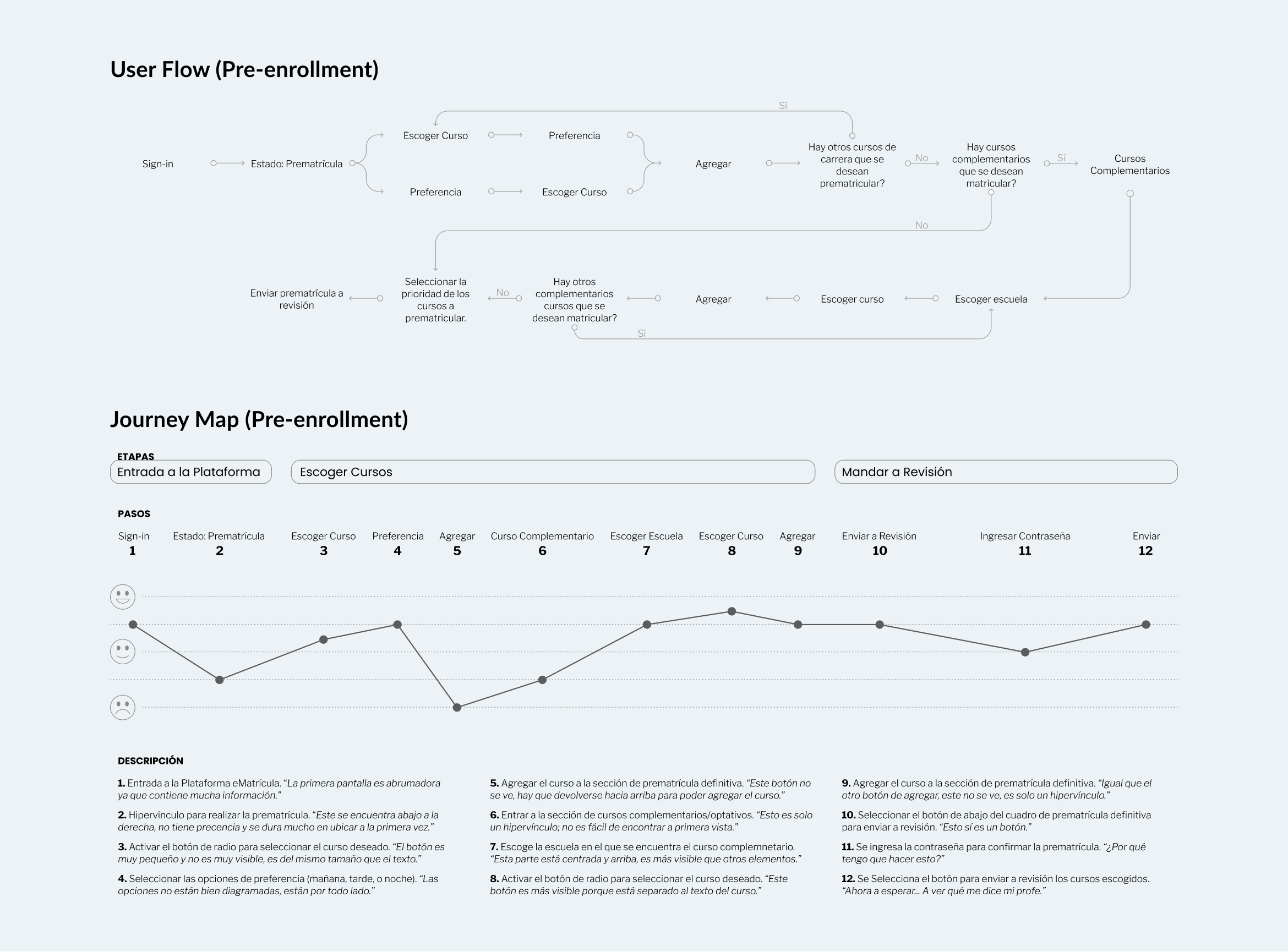
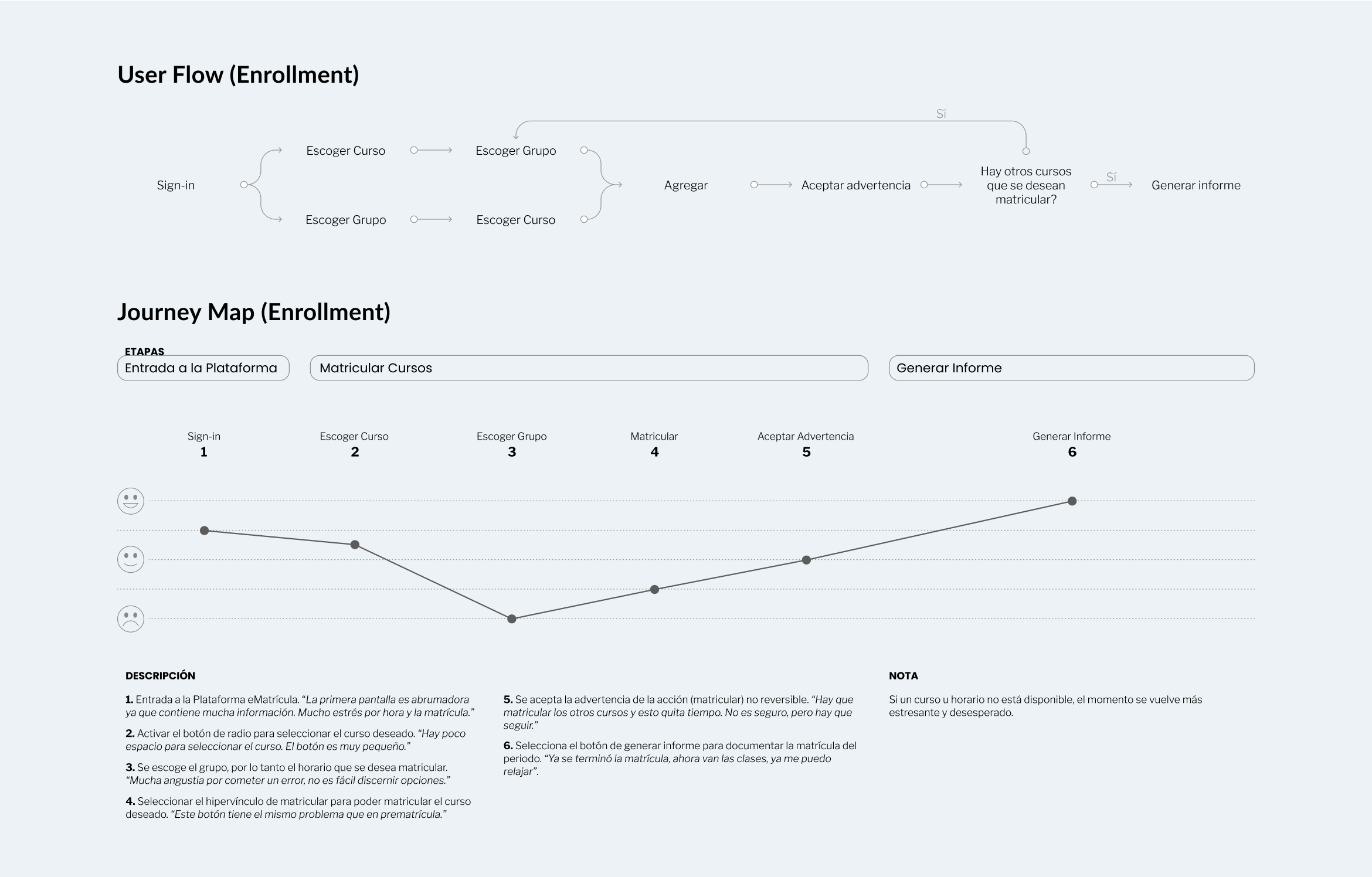
The flow of both processes has a recurring sub-flow of enrolling in different courses. These repetitive actions are accompanied by low canyons in emotion at first but later rise due to repeating steps and learnability.
Most of the emotional lows are due to confusion in the visual interface and UX of the platform.
Platform layout and UI is confusing
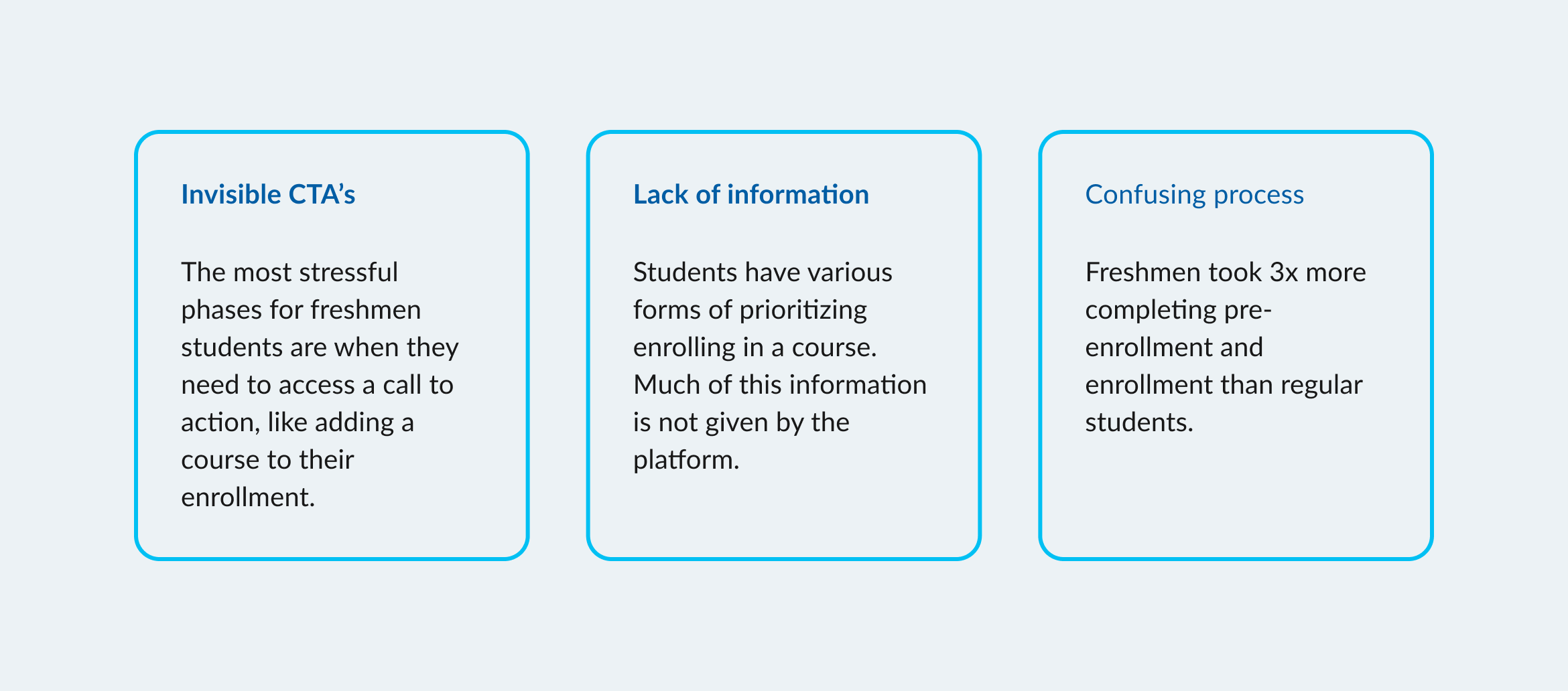
Students were divided into 2 groups for user testing on the old platform: freshmen (people that have never used the platform before), and regular students (people that have used the platform at least once). We wanted to know the differences between each group and their thoughts on enrollment.
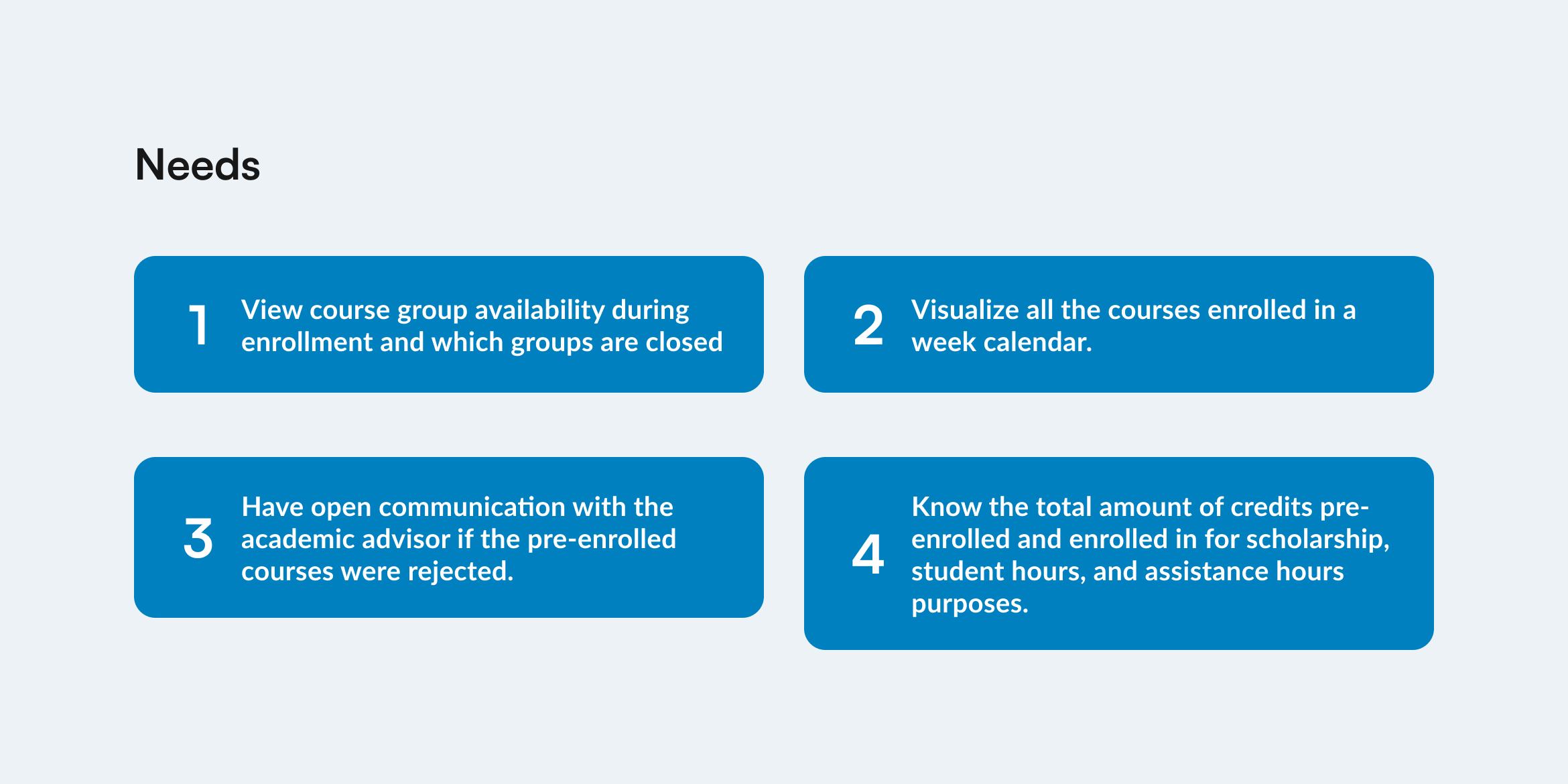
Global student needs
We identified the main needs of the students during each process through interviews and surveys. This information helped us organize and prioritize features and characteristics for the new platform design.
Aligning the University’s Goals and Project Goals
Business Goals
1. The process phases of pre-enrollment and enrollment should stay the same.
2. Decrease the error rate to less than 10%.
3. The platform should be accessible to all students.
4. The design should reflect the university’s reputation for excellence.
UX Goals
1. Ensure the visibility of all possible courses during pre-enrollment.
2. Maintain the user informed of course availability during enrollment even when not in their time slot.
3. Ensure all interactions and features are accessible to all users.
4. Enhance mobile responsiveness for students to be able to complete their enrollment through their phone if needed.
Designing a More Appealing and Intuitive Enrollment Platform
Precision in navigation design
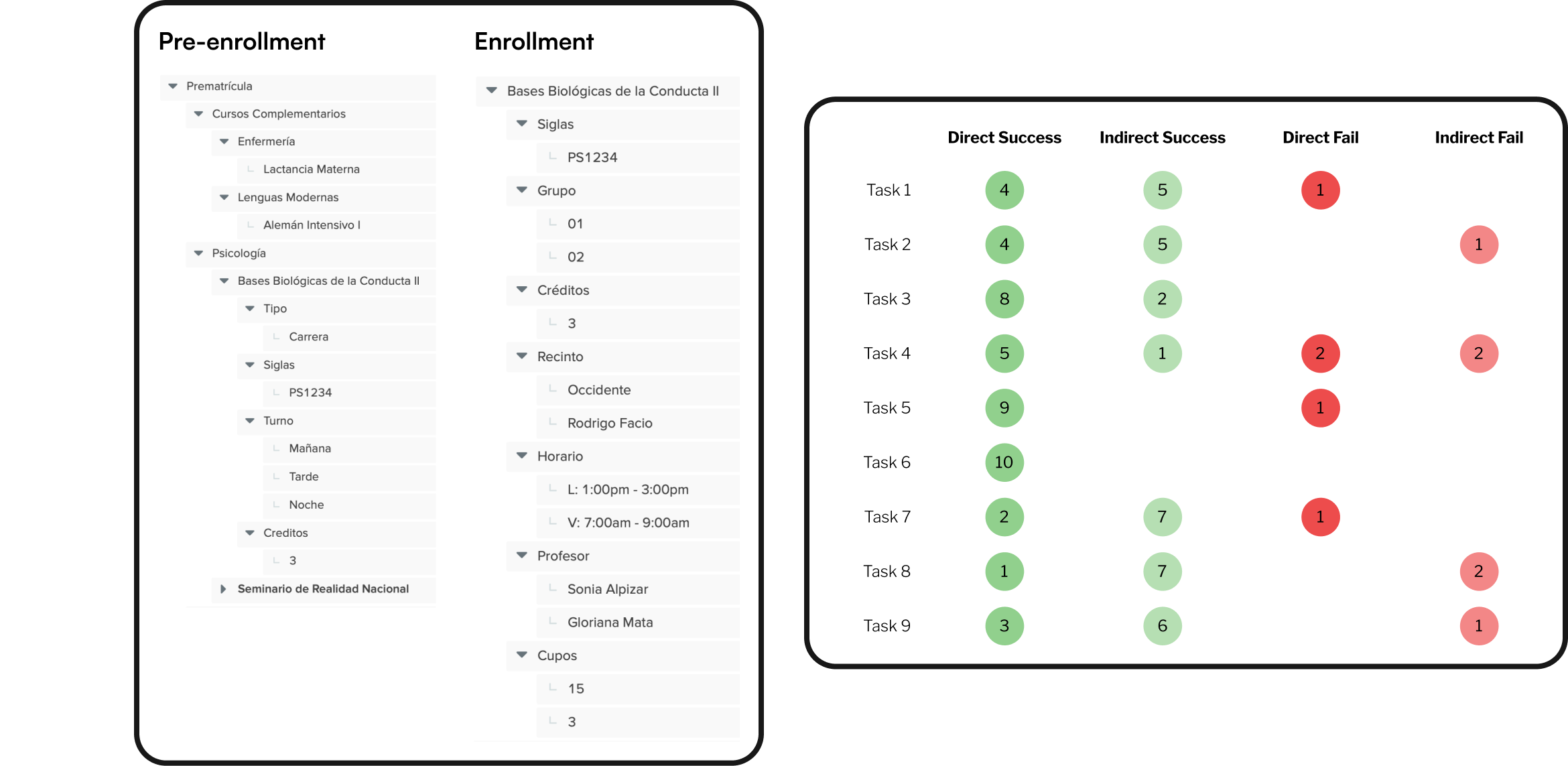
The navigation and elements of each part were designed with student feedback and admin technical input. To test this we conducted a tree test with 9 different tasks. These tasks contemplated each step of the enrollment process and gave us insight to user behavior and thinking.
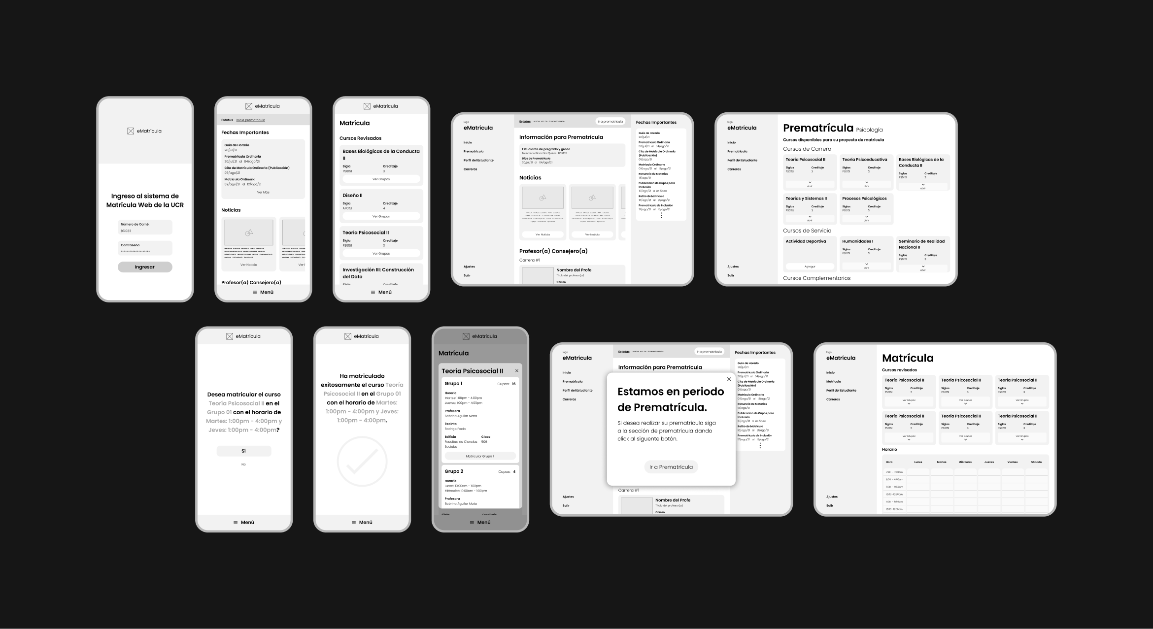
Wireframes
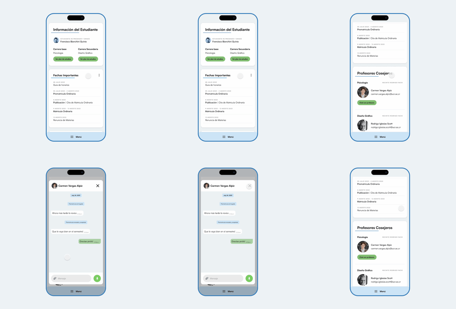
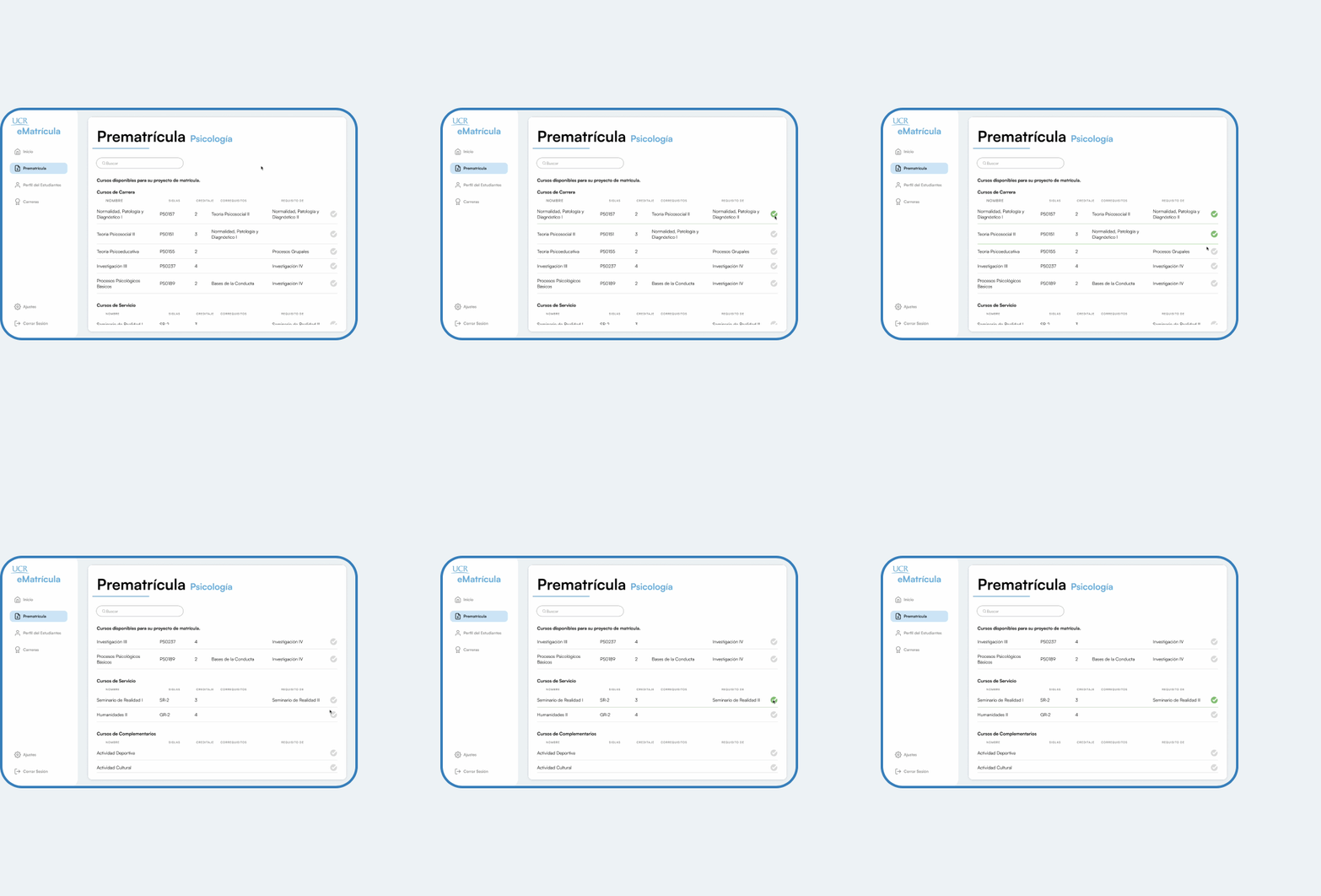
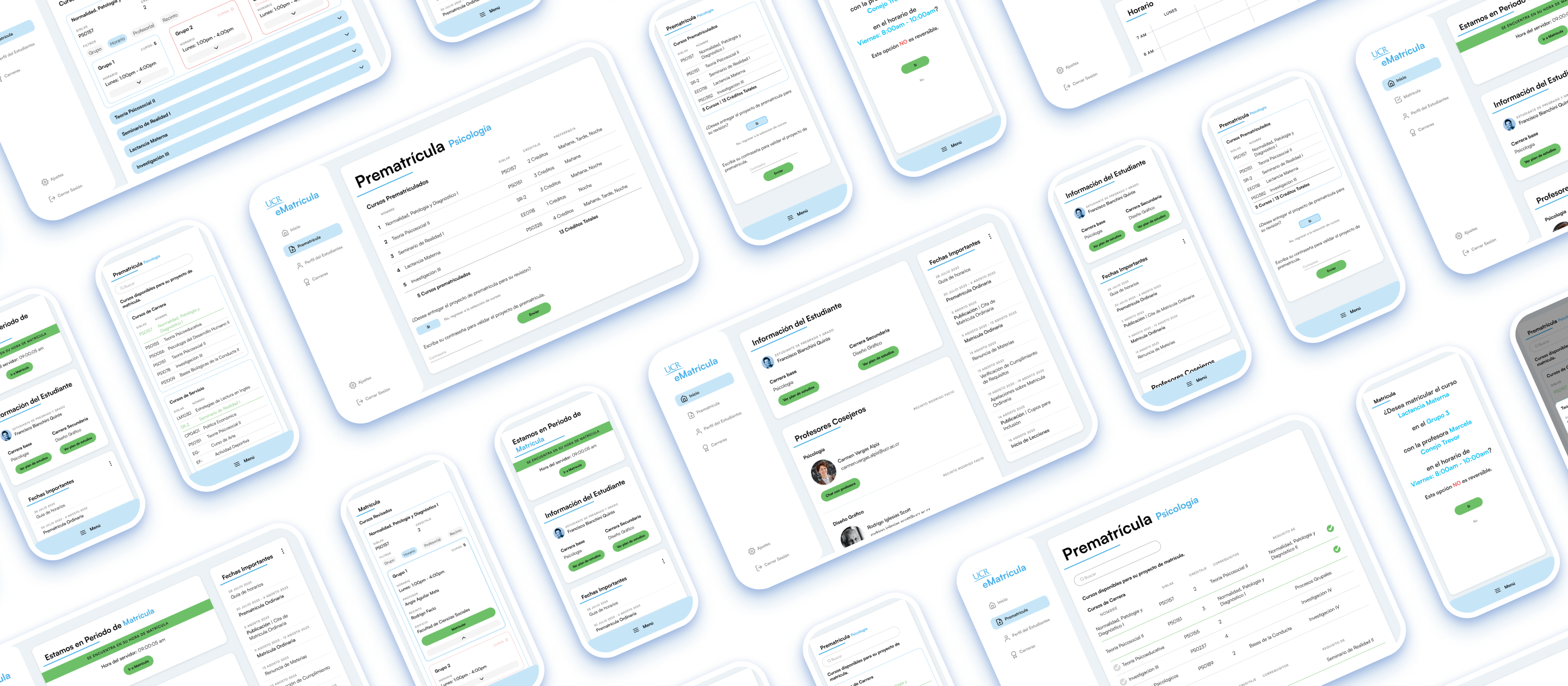
For the pre-enrollment and enrollment sections, we experimented with lo-fi wireframes to look into the many possibilities of adding and choosing courses. The information needed by users during pre-enrollment and enrollment differed, but are able to have a cohesive design through components.
We took on a mobile-first approach, due to the fact that daily digital activity is done through a user's phone in the home and outside.
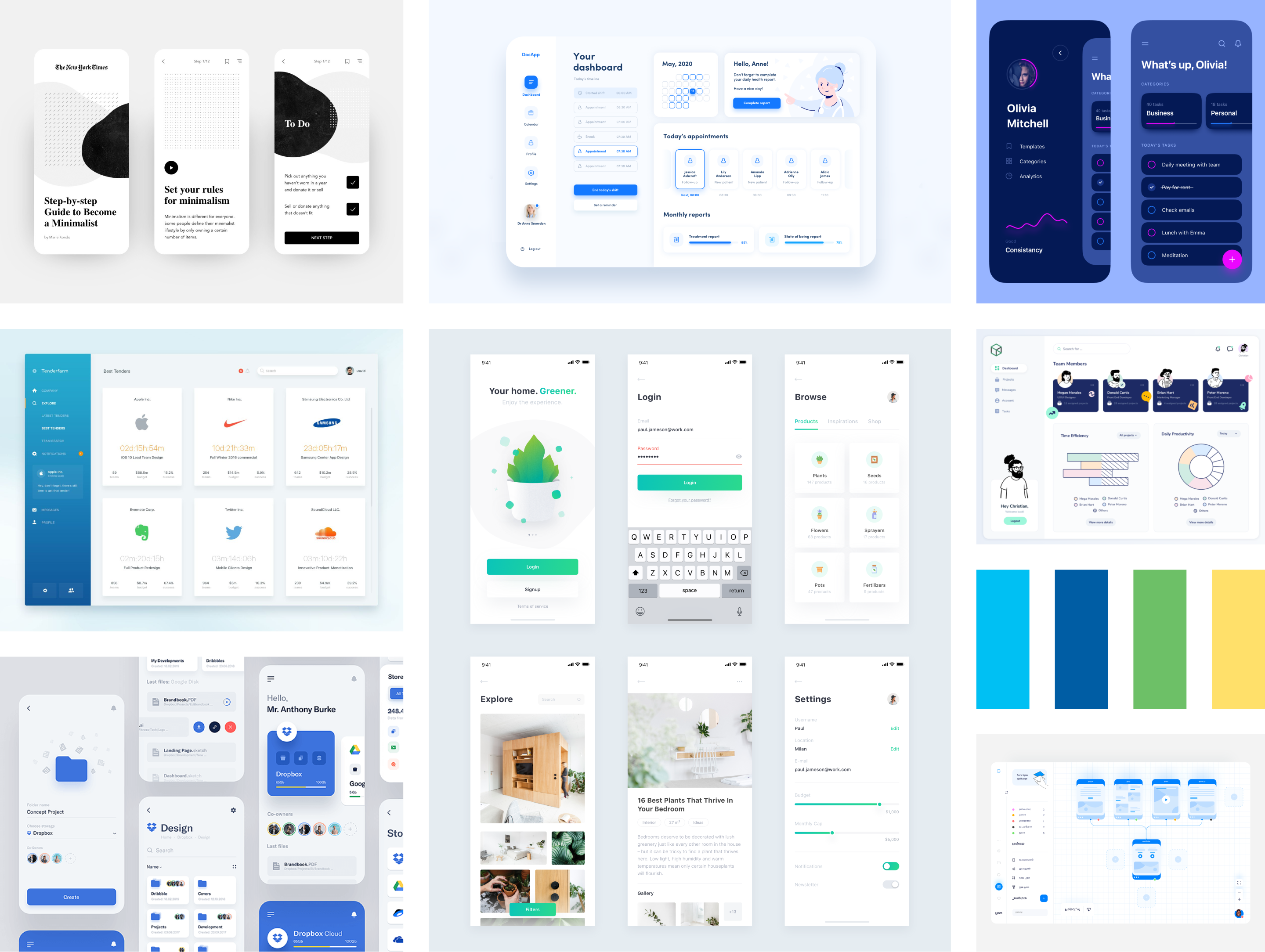
A Simple and Legible Look & Feel
During a stressful moment, minimalism, with its simplicity, aids the student in their task. This is essential for designing an enrollment platform where users seek to enroll for courses with limited spots.
The level of readability must be as high as possible, as students need to process all the information provided by the institution, from the status of the enrollment process to the details of each course. Errors in data communication and visualization can significantly impact the user in their upcoming semester.
The eMatrícula Platform
